
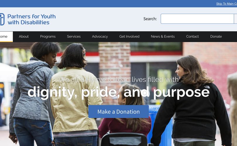
As you may have noticed, things look a little different around here than they used to. We launched our new website late last week (late-September 2018), and let me tell you: it’s a super exciting feeling.
When creating the site, we wanted to make sure that our new website was going to be as accessible and inclusive as possible. That was our key priority and the driving factor behind all our design decisions through this process. We’re proud today to say that we believe the site meets the highest level of web accessibility out there (AAA level of the WCAG), but it was a process in getting to this point.
In the interest of spreading inclusive design principles and practices, I wanted to share today some of the key lessons I’ve learned from leading our website design process. Considering 20% of people in the world have a disability, we believe it’s crucial for every website to be designed to be accessible to all.
Lesson 1: Find partners & team members that recognize the importance of accessibility and inclusion.
You would think this first step would be easy. Considering the Americans with Disabilities was passed over 28 years ago, you would think that everyone would have adapted to living in a world where accessibility and inclusion was the standard, accepted norm. You’d think.
Unfortunately, web accessibility isn’t nearly that common. If you’re looking for a web developer to create your site, be sure to ask about their familiarity with accessible design principles. Because too many developers still view accessibility as an add-on. A nice-to-have-but-not-essential feature. Something they haven’t spent much time thinking about, and something they don’t bother to test for during their design process.

We’ve been lucky enough to be working with the fantastic design team at Thunder Media Group since 2012, who have been excited to learn about web accessibility alongside us over the past 6+ years. In their words, “We really should be thinking about web accessibility by default.” Together, we participated this year in the 2018 Accessibility Internet Rally (OpenAIR) hosted by the nonprofit Knowbility. As part of the OpenAir competition, Thunder Media received free training on accessible web design, and we were able to have our new website reviewed by experts in the field.
Lesson 2: Familiarize yourself with the WCAG.
The Web Content Accessibility Guidelines (WCAG) are the accepted standards and best practices for online accessibility. These guidelines are published by the World Wide Web Consortium (W3C), and serve as the benchmark for accessibility in federal guidelines and standards. There are three levels of web accessibility: A (meh), AA (good; legal benchmark), or AAA (ideal!).
While implementing the standards can get very technical, the key principles that the WCAG is based on are rather simple and understandable even by non-technies. At a high level, the principles are there to ensure that:
- All users should be able to perceive all information, content, and site features.
- All users should be able to operate all site features and navigate easily around the site.
- All users should be able to understand all information, content, and site features.
- The site should support all forms of assistive technology.
At the end of the day, these are the key questions you should be asked yourself through the entire web design process. Can everyone operate our site easily? Can they understand it? Perceive it?
Lesson 3: Prioritize user-friendliness.
As we learned more about the WCAG, we realized that the principles overlap and share many similarities with the principles of good User Experience Design (UX). If you make things easy for users to understand and use, you’re in the process going to be making things more accessible.
To make sure we were designing a site that was highly user-friendly, we enlisted the help of former PYD staff member Rivka Barrett, who is currently studying for a Masters degree in User Design (UX) from Bentley University. She organized a group of her classmates to help — Afrand Shahroudi, Amanda Holmes, and Courtney Jordan — and they all provided us with a heuristic analysis of our previous site, mock ups for possible site designs and features, and ongoing feedback throughout our design process.
This site would not be nearly as inclusive and accessible as it is without Rivka, Afrand, Amanda, and Courtney.
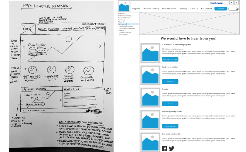
Lesson 4: Keep it simple.
Our guiding design principle when putting this site together was “Keep it simple.” We didn’t want to over-complicate the site, both in visual appearance and in navigation. We wanted to make sure that any site visitor could complete whatever action they wanted to take on the site in three clicks or fewer.
This led us to reducing the overall number of pages we have on the website, and to restructuring our site navigation. Instead of using drop-down menus — which can be difficult to code for accessibility — we simplified.
Lesson 5: Make it clean and beautiful.
One of the critiques I’ve heard of accessible web design is that it makes things ugly. And this might be the case when you think of accessibility as an after-thought — when you design a site without thinking of accessibility, and then try to retro-fit it in afterwards. Or it might be the case when a developer doesn’t understand accessible design principles well. But it doesn’t have to be that way.
In fact, accessible design can be beautiful. It can be clean and modern. It can be highly engaging. I’d argue that following accessible design actually makes it more likely that your site will be engaging, clean, and beautiful to look at. If you’re designing your site to be simple and user-friendly, you’re much more likely to end up with a final product that’s clean and visually appealing.
Inclusive design is good design. Period. End of story.
Thank you to everyone that has helped turn this site into a reality. Thanks to Shane and Stephanie at Thunder Media. Thanks to Rivka and all our other volunteers from Bentley. And thank you to the 2018 OpenAir team at Knowbility.